Monday, 30 June 2014

Metro: MACBA, Barcelona - Xavier Ribas


I have recently been on a research trip to Barcelona, while here I visited the Xavier Ribas exhibition at MACBA. What I found interesting is the underlying ideas and concepts behind the work, of which my ork is taking a similar direction. One such example is planning to find white vans and make images of, rather than just documenting the developing spaces. Ribas' work has a strong political message, perticularly with the bomb =bed landscapes and mass graves that are the subject matter. On looking at the catalogue for the show I was extremly dissapointed in the lack of representation of the methods of displaying the images in the show. If i wasx to make a publication I think I would document how my show looked along side full page scans of the actual images.


One other example that stood out to me of how you can play around with the exhibit was at the Picasso Museum...

Wednesday, 25 June 2014

Metro: Mass Observation Exhibition / Workshop

In my research on the Mass Observation I came across a website called 'Bolton Worktown' which is a great resource ad archive of the original members (www.boltonworktown.co.uk). After a few emails I found out that the website was produced as part of a PHD's students research in Bolton. Caroline is coming to the end of her research and wants to make her work more visible to the public of Bolton. She is hosting seven day events in a disused shop in the town center, of which I am running one of them. I began by looking at the archive that she had made available online. I found a really strong image by Humphrey Spender on his revisit to Bolton in the 80's. It was of the demolition of Davenport Street pictured below.


This links extremely well to my project of transient spaces, and could be a good addition to the workshop. Could I revisit this space and exhibit along his findings of Bolton in a state of development. Did he document this space in the 30's? For the day event I intend to produce images at the beginning of the day relating to a theme that I have to decide on yet. Print at the facility's in the shop, then host the workshop around the theme and exhibit the results throughout the day. 


I will use this as a bit of a tester, to see how I could introduce participants to my final project. Would my images work alongside others? How could I curate them to keep with the same ethos of my project? Hopefully this exercise will help me answer a few of these questions. Potentially I could get the workers of the Metro to take photographs in their daily routine. Could have some interesting results, my previous experience with the LAW magazine shoot the Boot's disposable camera had the best results.


I have a bit of a plan for what I intend to do with the shop space. But all this is open to development after I decide on my main theme of the day.


Davenport Street now, seems a little too far for the workshop but will mention in the meeting with Caroline.


Metro: Yorkshire Sculpture Park Visit

From my recent feedback and group crit sheets, the exhibition lacked a site specific element to it which I have always liked to touch upon. I personally was happy with it being as simple as the tram lines and station running parallel to Federation House. On a few feedback sheets this did come across and I like the links to be subtle. The orange background to my exhibition, mirroring the builders uniform guarding outside was one such example.


From this I decided to do a research trip to look at how artists have worked with site specific and study what materials they have used. Yorkshire Sculpture Park has a rich an diverse archive on display. I was especially interested in the new Ai Weiwei exhibition in the chapel.


What I found interesting (and carried on throughout the trip) was the materials Ai Weiwei used. On first glance the tree is made up from old pieces of wood, bolted together. But on closer inspection it was steel casts of a tree that had rusted over time. This adds an element of site specific as the tree blends into the landscape in its rusted form. The next part of this show was inside the chapel itself. This contained 18th century traditional Chinese seats which you were invited to sit on. This added audience interaction and really made me consider the history of the furniture that was supporting me. On later reading I found that these were representing Chinese citizens who were denied the rights to travel. The intention was to make you consider and think about the issue, but when we were greeted by the supervisor, none of this information was fed to us. Thus loosing the main idea behind this work. 

The next piece of work I was interested in viewing was James Turrell's, Deer Shelter Skyspace. What intrigued me into this work was how traditional looking the entrance was and how it merged into the fields of the park. I entered not knowing at all what I would find, and I was shocked. As you entered the brick laid arches you were greeted by slick embedded lighting on smooth concrete slabs, a strong contrast which I enjoyed. 


The perimeter of the space was a bench which back was angled to encourage the viewer to look up. In the roof was a square cut out which opened up to the sky. By placing you in this new slick environment and framing out a section of the sky, you reconsider a part of the landscape you thought you were familiar with. It reminded me of when a TV is in a pub (on of my pet hates), no matter who you are with, you, and almost everyone else in their is drawn to look at it. 


Another standout work for me was Peter Liversidge's 'Everything Is Connected' piece. I had seen his work in galleries previously but this placed in a field brought a whole new context to it. Instead of reflecting on it with neutral whites surrounding it you make the links between nature and the chains that make and shape a natural landscape. What I also liked about this was how free you were to view the work. You could look at it almost half a mile away or get up close and even touch it.


As I was researching and looking how different materials are used in the park and also trying to gather ideas as to how I can work with the materials I intend to use, this Sol LeWitt piece was an obvious choice to study. I was thinking about using breeze blocks myself. The reason why this material is used in the park I think is to look at the contrast of what environments surround us in urban life and what actually powers the world. Where we have come from and where we are now.


I have a very different messages as to why I'm using this material, but what it has learnt me is how diverse mediums can be with what ideas they provoke. I need to think about introducing these materials in a subtle (but not too subtle) manor, making the viewer think about the transient periods of urban sprawl.

Sunday, 15 June 2014

Metro: Think / Classify - Evaluation

I learnt a lot from our interim show, just seeing how my plan looked in reality was helpful in itself. I learnt what worked and didnt, but I also encounted problmes that I had to overcome. I have gained a lot of exoerience and learnt how to improve this approach in future projects.


What worked:

The material of the high vis vest of the construction workers was a stand out element of the installation. Actually using the material was more successful than I anticipated as mimicking the colour on Photoshop didn't give the physical installation justice. When in discussion with people who viewed the work, one reaction stood out the most - 'Your eyes try and fill in the gaps between the objects and the images'. Introducing ephemera associated with construction made the viewer consider the change in the landscape.


What Could be Improved:

The layout of the space was already installed so I had to rework my plan. I had to alter a few parts of the installation without loosing to much of my original idea. One part I did think that was important that I missed out was the missing panel gap that would emphasize the whole structure being in a state of flux and transit of construction. Evaluating my images I have now seen a suitable space in which I could have done this (Squared off in images below). Another area was the sand installation of which I thought ten bags would be enough to use as a 'plinth', I was wrong. The proposed image overpowered the size of the pile and looked out of proportion. Any more sand was difficult to come by in such a short space of time. But at the end I actually preferred the sand on its own. One last problem I had with the pre-installed panels was that I wasn't allowed to spray the construction paint directly onto the panel so I had to spray onto a sheet and then stretch it over. Again as this was a last minute issue I had to use white material that wasn't the same tone as the paint and looked slightly unnatural. 


What else have I learnt:

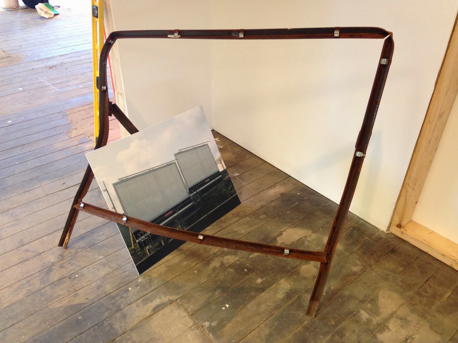
Their are a few other small points that I have learnt from this exercise, I think that I could have varied the sizes of my prints as the installation wasn't uniform and rigid, it was very loose, exhibiting parts on the ground, incorporating different colours as backgrounds for images etc. But keeping all the images 20 X 24 doesn't follow this approach. I could even think about exhibiting the images off the wall and in or around the objects (see image below) Secondly I would maybe introduce a small piece of tape or signage as to keep people away from touching delicate parts of the installation.